
Discover the Art of SwiftUI
Immerse yourself in “Crafting Consistency,” the definitive guide to mastering SwiftUI for building adaptable, efficient, and scalable application design systems. Whether you’re a beginner aiming to get it right the first time or a seasoned developer refining your skills, this book provides the essential frameworks and strategies to enhance your projects and coding prowess.

The promo code is valid only for the first 100.
What You’ll Learn
- Establish a solid design foundation with customizable color palettes, fonts, and icons.
- Master the creation and management of reusable Swift Packages.
- Implement continuous integration and deployment for real-time updates.
- Develop bespoke components like text fields, buttons, and navigation bars that align with your unique design language.
- Integrate comprehensive testing to ensure UI consistency and reliability.
- Building a showcase app to visualize all the design system’s styles, elements, and components, providing a hands-on, interactive learning experience.
- Using the built design system in a real-world application, demonstrating how to seamlessly integrate and utilize the system across different projects for practical, professional use.
Inside the Book
Chapter 1: Crafting Consistency
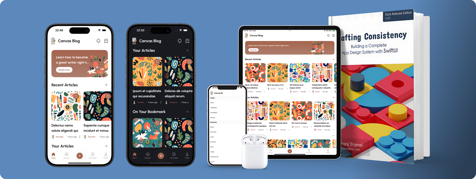
In this opening chapter, we introduce the core concept of a design system and its pivotal role in building scalable and maintainable applications. We discuss the importance of consistency—not only for operational efficiency and ease of development but also as a critical branding component. A consistent design ensures users can navigate and interact with your app effortlessly. By utilizing the CanvasKit design system, we’ll explore how guidelines and reusable components can be crafted to uphold a uniform user experience across your entire application, setting a strong foundation for the detailed design and development work that follows.
Chapter 2: Package Setup
This chapter guides you through the foundational setup necessary for building and managing your SwiftUI design system efficiently. We establish a Git repository to track and control versions of our project, ensuring that all changes and iterations are meticulously organized. Next, we create an Xcode workspace named CanvasBlogDemo, which serves as a central hub for managing the multiple components of our design system—the CanvasBlog App, the CanvasPlay preview App, and the CanvasKit library. This setup simplifies development and enhances maintainability. Additionally, we delve into the functionalities of the Swift Package Manager (SPM), which is essential for managing our project’s dependencies. We also introduce snapshot testing with an Xcode template to guarantee the visual consistency of our UI components. Finally, setting up a continuous integration (CI) server will automate the testing and deployment processes, ensuring a smooth and efficient workflow.
Chapter 3: CanvasKit Styles – Color
In this chapter, we dive into the creation of CanvasKit styles, starting with the color schemes that will define the look and feel of your applications. We transform abstract design concepts into practical, usable color styles using a Figma design system as our visual guide. This approach ensures that every color choice is aesthetically pleasing and consistent across the entire design system, providing a solid foundation for building visually coherent applications. This chapter is crucial for developers looking to understand and apply effective color management within their SwiftUI projects.
Chapter 4: CanvasKit Styles – Typography
This chapter focuses on implementing typography within our CanvasKit design system, emphasizing its crucial role in mobile app development. Effective typography is not just about choosing attractive fonts; it significantly enhances the readability and accessibility of an app, contributing to its overall aesthetic appeal. We’ll explore integrating a cohesive typographic style that complements and enhances the user interface, ensuring that text elements are beautiful and functional. This discussion is essential for iOS developers aiming to create visually harmonious and easy-to-navigate apps.
Chapter 5: CanvasKit Styles – Iconography
In this chapter, we’ll focus on the vital role of icons within the CanvasKit design system and detail how to integrate a custom set of icons into your package effectively. Icons are essential for enhancing the user interface, providing intuitive visual cues that make navigation simpler and interactions more intuitive. Adding well-designed icons improves the overall user experience, making apps more accessible and visually engaging. This chapter is essential for iOS developers who want to learn how to effectively use iconography to elevate the functionality and aesthetic of their applications.
Chapter 6: Implementing a Theme Manager in CanvasKit
This chapter explores the development of a theme manager called “AppTheme” within our CanvasKit library. The theme manager is an essential component for modern apps, allowing switching between light and dark themes. It offers more than the standard device settings by allowing users to tailor themes specifically for CanvasKit apps, thus aligning perfectly with our design system’s guidelines. We will also discuss how this functionality meets current design trends and opens possibilities for future enhancements, like adding multiple themes to increase accessibility. This chapter is particularly useful for iOS developers looking to provide a more personalized and accessible user experience through adaptable theming options.
Chapter 7: Standardizing Spacing in CanvasKit with CanvasSpacing
In this chapter, we focus on a crucial aspect of UI design—standardizing spacing within the CanvasKit framework based on our Figma design system. We’ll delve into the patterns of consistent and standardized paddings that significantly maintain a cohesive look across various components and elements. We create a visually balanced and harmonious interface by ensuring uniform spacing, such as between carousel titles and items. This standardization is key to your apps’ professional polish and functionality.
Chapter 8: Helper Modifiers
This chapter delves into the advanced usage of SwiftUI’s helper modifiers, tools that enhance the flexibility and cleanliness of your code. We’ll start by exploring conditional modifiers, such as the if modifier, which adjusts the appearance of views based on specific conditions, making your UI more dynamic and responsive. However, using these modifiers judiciously is crucial to avoid common pitfalls that can lead to bloated and less performant code. Additionally, we’ll tackle the challenge of detailed layout management in SwiftUI by introducing custom modifiers like the Measure Size Modifier. Using a GeometryReader, this modifier allows developers to measure views accurately.
Chapter 9: CanvasButton
This exciting chapter in our CanvasKit design system journey focuses on crafting a custom button, a fundamental component in any app’s user interface. Leveraging the groundwork we’ve established with design, colors, fonts, sizes, spacings, and icons, we’re ready to create a versatile and visually appealing button. Our Figma design system details this process, providing a clear blueprint to follow. Don’t worry about the complexity; we’ll break down each step to simplify the integration of various design elements. By the end of this chapter, you’ll have a dynamic and fully functional button ready to enhance your app’s interactivity and style.
Chapter 10: InputField
This chapter focuses on Canvas input fields, an integral part of user interaction within any app. These fields are the primary interfaces users enter data, making their design and functionality key to a positive user experience. We’ll explore the nuances of crafting effective input fields, from understanding their role in user interaction to integrating them seamlessly within our CanvasKit design system. By mastering the design and implementation of input fields, you’ll ensure they are functional and enhance your app’s overall usability and aesthetic.
Chapter 11: Canvas Navigation Bar
This chapter delves into the Canvas Navigation Bar, a cornerstone of user navigation in iOS applications. Navigation bars are pivotal in guiding users through different sections of an app, facilitating an intuitive and efficient user journey. We’ll explore how to implement various styles of navigation bars within our CanvasKit design system, each tailored to fit specific contexts and screen types, such as the home view versus the article screen. By understanding and applying these design variations, you’ll ensure your app looks cohesive and provides a user-friendly experience across all its interfaces.
Chapter 12: HorizontalTab
Building on the previous chapter’s foundational knowledge of Preference Keys, this chapter introduces the Anchor Preference Key—a specialized tool designed for effective data transmission within an application’s hierarchy. We will apply this key to implement the Canvas HorizontalTab view. This chapter is crucial for developers looking to deepen their understanding of SwiftUI’s data-handling capabilities while adding a polished, professional touch to their applications.
Chapter 13: Avatar
This chapter delves into creating an Avatar view, a key element in personalizing user interfaces. Using a reference image from our design system, we explore seven distinct styles of Avatars, each designed to offer unique visual distinctions. You’ll learn how to craft each type with attention to the subtle variations that set them apart, enhancing the user’s experience by providing options that cater to different preferences and contexts.
Chapter 14: Chip
This chapter explores the “Chip” view, a seemingly simple yet crucial component of our design system. While Chips may appear straightforward, their importance and versatility in user interfaces cannot be understated. These small elements significantly enhance interactivity and provide users with quick, actionable options like filters or tags. We will delve into the various implementations of Chips, highlighting how their simple design can be adapted to serve multiple functionalities within an app.
Chapter 15: Bottom Bar
This chapter focuses on developing a custom bottom bar from the Figma design system that aligns with our design specifications. While this bottom bar deviates from the traditional SwiftUI TabView, our goal is to effectively utilize existing SwiftUI components to craft a solution that enhances the app’s functionality and maintains a clean and manageable codebase. By customizing the bottom bar, we enhance the navigational experience, providing users with intuitive access to the app’s core features while adhering to a sleek, modern aesthetic that complements the application’s overall design.
Chapter 16: Understanding Components in Our Design System
This chapter delves deeper into the integral building blocks of our CanvasKit design system—the components. After establishing a solid foundation of styles and elements in the earlier chapters, we now focus on constructing more complex units. Components serve as the cornerstone of our design system, enabling us to consistently apply and reuse the established styles and elements across various parts of the application. This chapter is crucial for understanding how to efficiently assemble these components to create a cohesive and functional user interface, ensuring that each element works harmoniously within the broader system to enhance the overall user experience.
Chapter 17: Creating the NewsCard View
This chapter focuses on creating a new and essential component within our CanvasKit design system—the “NewsCard.” Designed as a cell-type view, the NewsCard is set to be a staple across various parts of our application. We’ll explore how to make each NewsCard visually appealing and functional.
Chapter 18: Home View of CanvasBlog
This is the chapter where we combine all the design elements, styles, and components we’ve meticulously crafted throughout this book to construct the home view of our CanvasBlog application. This chapter is pivotal as it demonstrates how to integrate and apply the foundational elements of the CanvasKit design system to a real-world project. We will focus on crafting a user interface for the home view that is aesthetically pleasing but also functional and user-friendly. By the end of this chapter, you will see how the different pieces of our design system come together to create a cohesive and engaging digital environment, providing a practical example of how to effectively apply the principles we’ve discussed in a live app setting.
Upcoming Topics
There are still some crucial topics we need to address to enhance our application’s global reach and usability:
- Localization: Making our app accessible to a global audience by supporting multiple languages.
- Accessibility: Ensuring our app is usable by people with various disabilities.
These topics will be discussed in future updates to this book, continuing our journey toward creating fully-rounded, user-friendly applications.
Buy Now with a 15% Discount

Code: SWIFTSTART15 (The promo code is valid only for the first 100.)
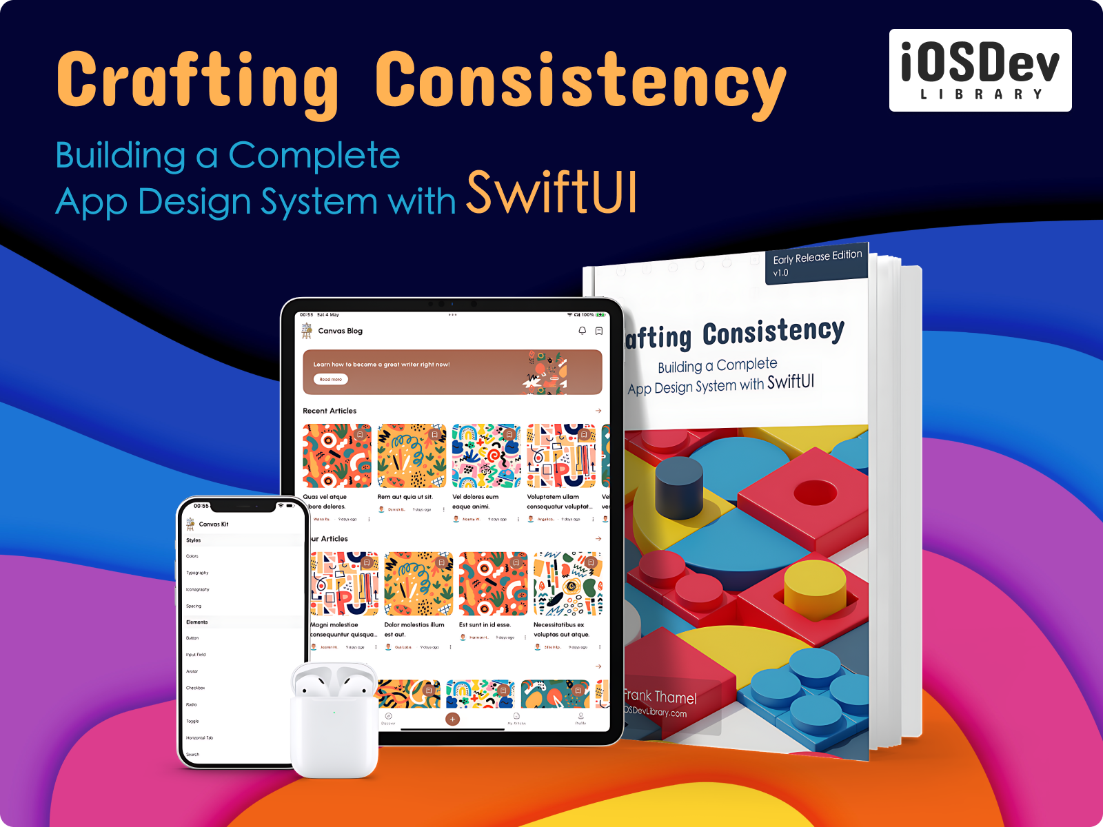
Crafting Consistency: Building a Complete App Design System with SwiftUI
About the author
Frequently Asked Questions
1. Is this book available in print or only as an eBook?
2. What does ‘early release edition’ mean?
3. Will I receive the Figma design files used in the book?
4. I’m new to iOS development; is this book suitable for me?
5. Are the Xcode project and other resources included in the book?
6. Can I generate an invoice after buying this book?

